Shake Up Your Kitchen: Rethinking Trendy Colors
- Jun 9, 2025
Brightly painted kitchens are a hallmark of many home trends, but these color preferences tend to linger, even after the trend has faded. Some of these pigment preferences lose popularity over time, but labeling them as obsolete may not be altogether accurate. There's still a place for these well-loved colors; it all depends on the specific space.
The importance of color can never be underestimated. It interacts with many factors like lighting, cabinetry, and various materials present in the kitchen. If your aim is to breathe new life into your cooking space and make it more modern, coloring is an excellent first step. Here's what interior designers recommend when reassessing color choices, including methods to contemporize them.
Two colors often debated are burnt orange and mustard yellow, particularly in the context of a kitchen. These vibrant hues, once seen as warm and friendly, now lean towards a nostalgic 1970s vibe that can be challenging to discard. They are not essentially unappealing but can pose a challenge when one's aim is to bring a modern feel, especially when used on long-lasting features like cabinets or walls.
Alyssa Anselmo, an architect and founder of Studio Anva, sees these colors as "emotionally charged." Despite their retro appeal, she believes they're best utilized sparingly. "Instead of going all out to paint an entire kitchen," she advises, "you can use them in more flexible, smaller ways, such as accessories or textiles. Some examples can be a vibrant toaster or a coffee machine.”
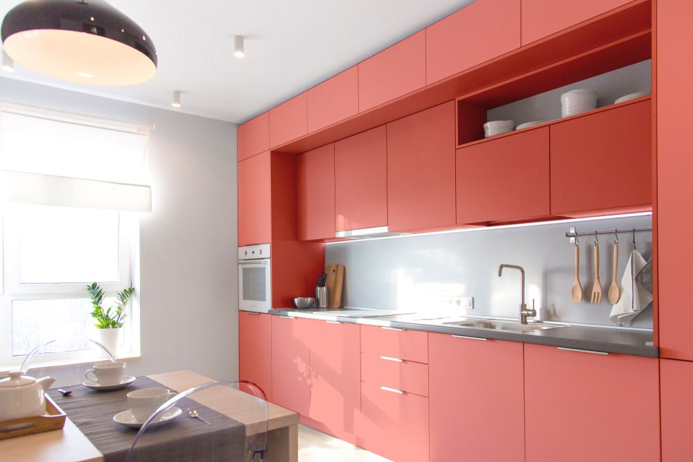
There was a time when the boldness of red lacquered kitchens was all the rage, especially in ultramodern homes embracing statement hues. However, the flashy red now feels overly assertive rather than innovative. The aesthetic often comes off as artificial, making it difficult to neutralize or blend into a subtler design.
Anselmo cautions about red, "It can be dominant, quickly rendering a space where you spend a considerable part of your day visually tiring. Bright red, whether lacquered or not, is definitely a no for me."
But she doesn’t suggest completely avoiding these retro or “outdated” colors. Instead, introduce those tones in smaller, flexible ways-like a vibrantly colored stool, a ceramic bowl, or a showpiece light fitting.
For many years, navy blue was the preferred color for kitchen cabinets and islands. As an appealing contrast to black or gray, it complemented brass features and marble countertops. But as architect and interior designer Daniel Joseph Chenin highlights, navy blue's ubiquity has made it seem commonplace.
In smaller kitchens, the darkness of the blue can feel heavy or excessively formal, which may not always align with the cozy atmosphere one desires. A change to deep, earthy greens or muddy teals, says Chenin, would be a more original choice. "These tones provide the same depth and intensity, but being connected to nature, they add color without being overwhelming," he states.
Charcoal gray, with its stunning contrast against white cabinets, became a modern kitchen essential. This created a trendy, metropolitan feel. However, the characteristics that made charcoal gray so beloved are now seeming a little too much.
Chenin states that charcoal gray can give a "cold and overly-factory-like feel, particularly when coupled with other harsh surfaces”. To achieve a more soothing look, Chenin suggests replacing charcoal with warm grays that have brown or taupe elements. These shades create balance, especially when layered with natural wood or brass.
We all remember the glossy white kitchen trend. It was the epitome of freshness, cleanliness, and modernity, particularly in open-plan homes. The reflective surfaces helped kitchens feel larger and brighter.
Chenin, however, observes that today, "the same glossy whites may seem too sterile and harsh." Furthermore, gleaming finishes readily show every fingerprint and mark, which isn't ideal for a high-traffic kitchen. An improved option would be a warmer white with a matte or satin finish-say, bone, ivory, or soft linen.